
Discover View
The DiscoverFragment is a view that loads and displays Voucher templates. Each template contains various assets that come from the Voucher Server and are used to help users to jump start their Voucher creation.
Basic Setup
Provided the create flow has already been setup, the simplest integration would be to create an activity and embed the fragment within it like so:
@ActivityTheme(ActivityTheme.Type.TRANSLUCENT_STATUS)
class DiscoverActivity extends LoadingBaseActivity {
    @Override
    protected void onCreate(@Nullable Bundle savedInstanceState) {
        super.onCreate(savedInstanceState);
        setContentView(R.layout.activity_discover);

        DiscoverFragment discoverFragment = DiscoverFragment.newInstance();

        getSupportFragmentManager().beginTransaction()
                .replace(R.id.content_frame, discoverFragment)
                .commit();
    }
}
@ActivityTheme(ActivityTheme.Type.TRANSLUCENT_STATUS)
class DiscoverActivity : LoadingBaseActivity() {

    override fun onCreate(savedInstanceState: Bundle?) {
        super.onCreate(savedInstanceState)
        setContentView(R.layout.activity_discover)

        val discoverFragment = DiscoverFragment.newInstance()
        supportFragmentManager.beginTransaction()
                .replace(R.id.contentFrame, discoverFragment)
                .commit()
    }
}
Customizations
There are many customizations that you can utilize to tweak the appearance of the Discover View in addition to the usual theming.
DiscoverConfig discoverConfig = DiscoverConfig.Builder.init()
        .backgroundColor(R.drawable.primary_color_gradient_background)
        .headerForeground(R.drawable.foregroundImage)
        .headerBackground(R.drawable.backgroundImage)
        .headerShowBackButton(false)
        .headerTitle("Header Title")
        .headerText("Header Desc")
        .buttonText("New Item")
        .templateCornerRadiusDp(16f)
        .templateElevationDp(0f)
        .templateGridColumnCount(2)
        .templateAspectRatio(2.5f)
        .templatePaddingDp(10)
        .templateShowActionButton(true)
        .create();
DiscoverFragment discoverFragment = DiscoverFragment.newInstance(discoverConfig);
val discoverConfig = DiscoverConfig.Builder.init()
        .backgroundColor(R.drawable.primary_color_gradient_background)
        .headerForeground(R.drawable.foregroundImage)
        .headerBackground(R.drawable.backgroundImage)
        .headerShowBackButton(false)
        .headerTitle("Header Title")
        .headerText("Header Desc")
        .buttonText("New Item")
        .templateCornerRadiusDp(16f)
        .templateElevationDp(0f)
        .templateGridColumnCount(2)
        .templateAspectRatio(2.5f)
        .templatePaddingDp(10)
        .templateShowActionButton(true)
        .create()
val discoverFragment = DiscoverFragment.newInstance(discoverConfig)
Header Customizations
Customizations here affect the area above the template selection space
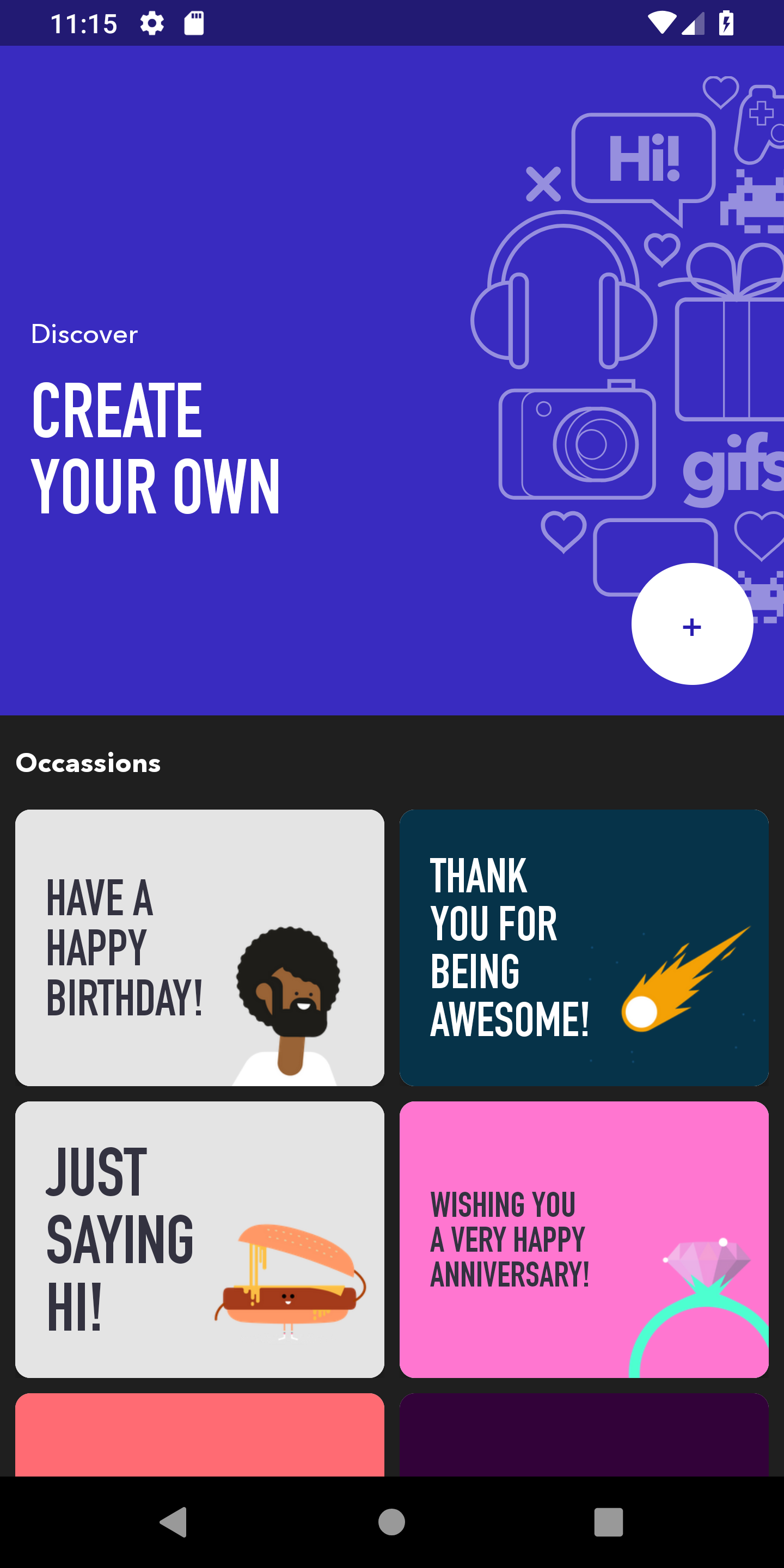
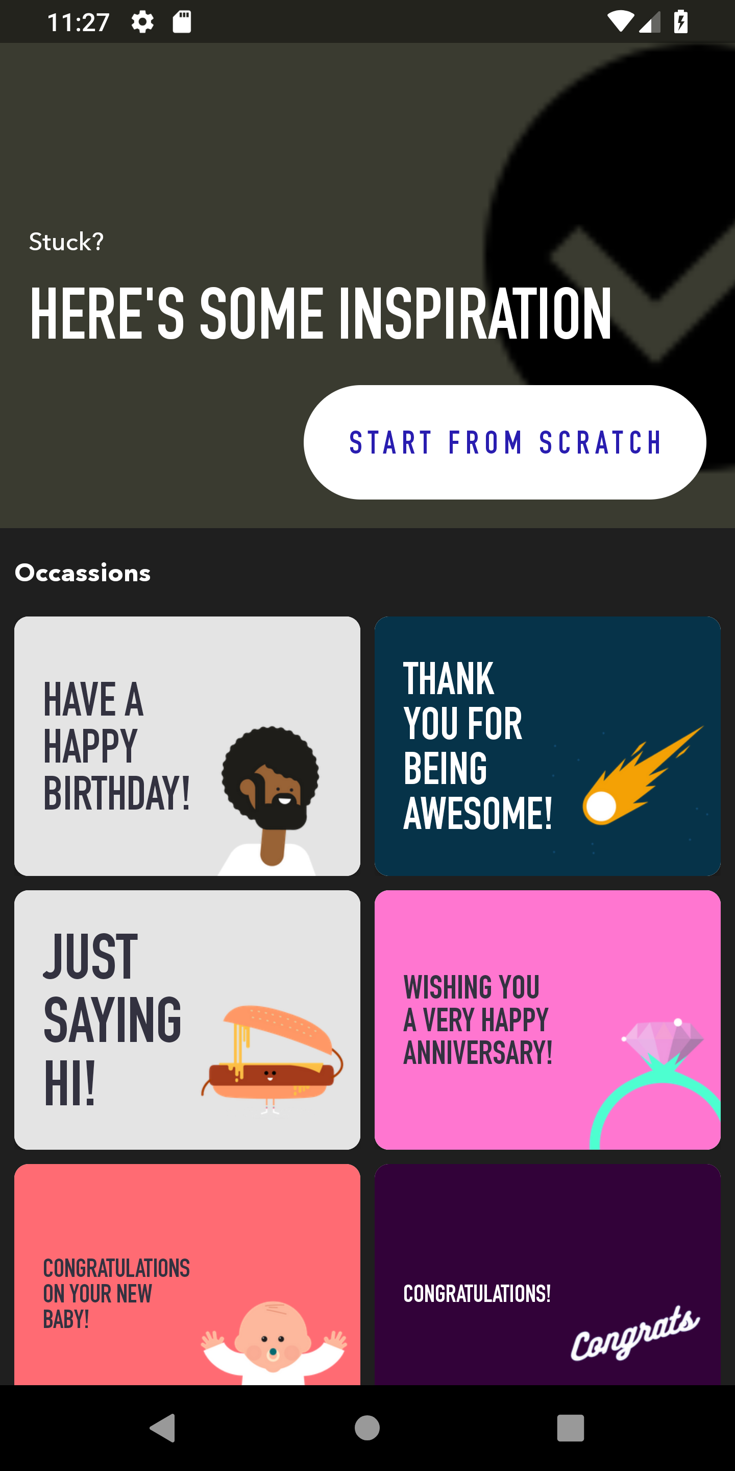
The screen on the left was transformed into the screen on the right using the following builder methods
    .headerTitle("Stuck?")
    .headerText("Here is some Inspiration")
    .backgroundColor(R.color.darkGrey)
    .headerForeground(R.drawable.ic_check_circle)
    .buttonText("Start From Scratch")
    .headerTitle("Stuck?")
    .headerText("Here is some Inspiration")
    .backgroundColor(R.color.darkGrey)
    .headerForeground(R.drawable.ic_check_circle)
    .buttonText("Start From Scratch")
In this instance the Header title, subtitle, background color, foreground image and button text were modified. The builder methods above follow that order.
By default the background and font will inherit the default theme colors, and the title, description and action button will contain the same content as the screen on the left.
Cell Customizations
Customizations can also be done to the individual cells on this page
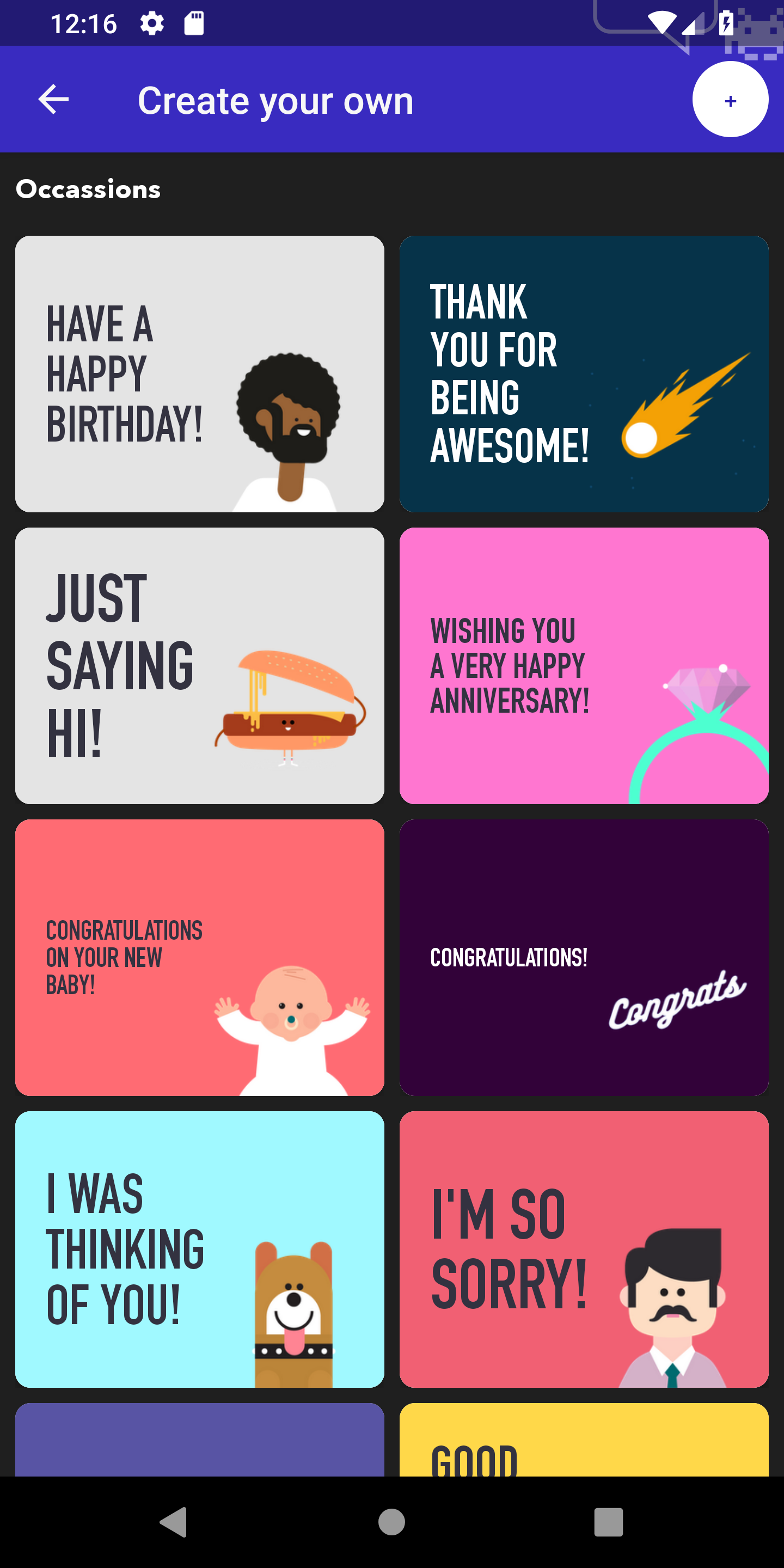
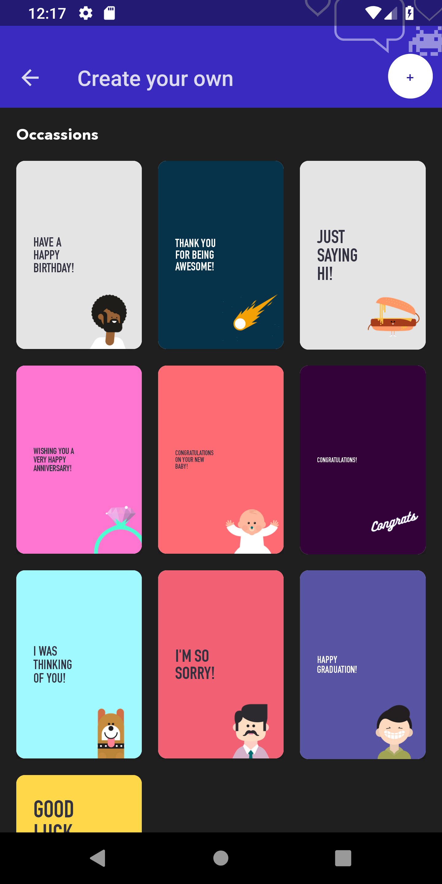
The following customizations used to transform the cells
    .templateAspectRatio(2f/3f)
    .templateGridColumnCount(3)
    .templatePaddingDp(15)
    .templateAspectRatio(2f/3f)
    .templateGridColumnCount(3)
    .templatePaddingDp(15)
The screen on the left uses the default padding of 8dp, and an aspect ratio of 4/3. The screen on the right adjusts the aspect ratio to 2/3, adds another column, and changes the padding to 15dp.
By default, 8dp of padding will be provided around the cells, displayed in a single column with a 1:1 aspect ratio.
Pre-populate Merchant in Discover Configuration
You can pre-populate Merchant information in Discover screen
        // First two parameters country code and currency are required.
        Observable<List<Merchant>> result = Engine.voucherContentManager().searchAllMerchants("US","USD",null);
        result.subscribe(new Subscriber<List<Merchant>>() {
            @Override
            public void onNext(List<Merchant> merchants) {
                Merchant merchant = merchants.get(0);
                DiscoverConfig.Builder discoverConfigBuilder = DiscoverConfig.Builder.init().skipEditScreen(false).prePopulateAmount(25.00, "USD")
                        .prePopulateMerchant(merchant);
                Fragment discoverFragment = DiscoverFragment.newInstance(discoverConfigBuilder.create());
            }
        });
        // First two parameters country code and currency are required.
        var result = Engine.voucherContentManager().searchAllMerchants("USD","US",null)
        result.subscribe{
            var merchant = it[0]
            val discoverConfigBuilder = DiscoverConfig.Builder.init().skipEditScreen(false).prePopulateAmount(25.00, "USD")
            .prePopulateMerchant(merchant)
            val discoverFragment = com.surpriise.vouchrcreate.discover.DiscoverFragment.newInstance(discoverConfigBuilder.create())
        }